Neurocrine Access Support for CRENESSITY
Neurocrine Access Support is a program designed to help patients, caregivers, and healthcare professionals access and afford treatment for CAH through the use of CRENESSITY (crinecerfont). As Art Director, I led the creation of the program’s visual identity and designed a scalable, user-friendly website to support both patient and HCP needs.
Healthcare UX, UI Design
Design Strategy
Visual Identity
Data Visualization
Cross-functional Collaboration

Identifying the Need
Approach
Neurocrine Biosciences partnered with our team to launch Neurocrine Access Support (NAS), their first patient support initiative, and introduce Crenessity for a rare condition. I focused on creating a scalable brand and digital experience that delivered clarity, empathy, and compliance while laying a strong foundation for future program expansion.
Collaboration & Execution
Working with UX, design, development, medical, and project teams, I helped ensure alignment and accessibility while navigating a complex regulatory landscape.
Core Team:
-
Art Director (my role)
-
Freelance & contract designers
-
Studio Rx Website production team
-
Account manager
-
Project Manager
-
UX Designer
-
Medical Writer
Phase One: Ideation
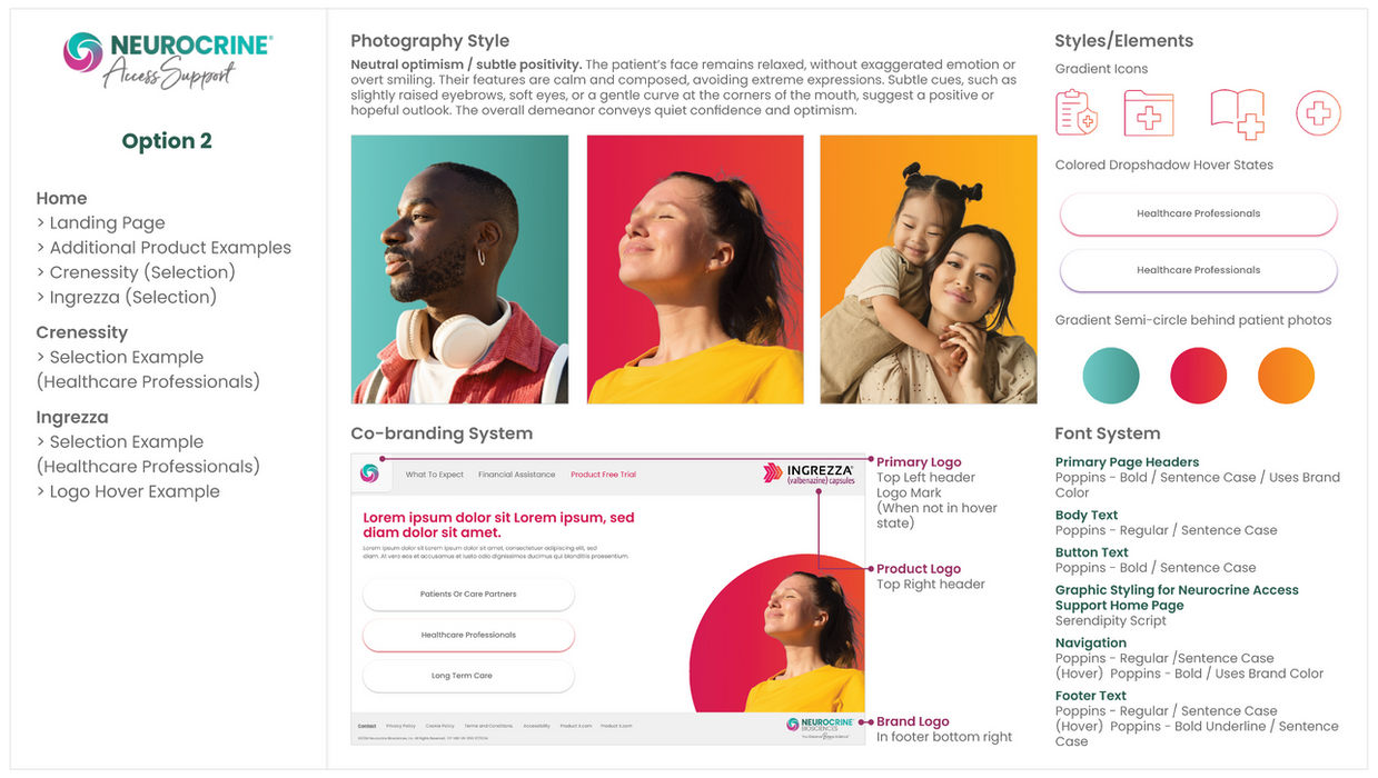
With no existing direction in place, I initiated the process by presenting a range of visual style explorations to help the client define the tone, structure, and overall visual identity of the support program. These early concepts served as a strategic starting point for across products.
Phase Two: Establishing the Visual Identity
After gathering feedback, I worked with an editor to draft a content outline that included structure, usage guidelines, and flagged challenges around building a scalable system. Our goal was to ensure future brand variations could be supported without sacrificing consistency. Click here to view the collaborative draft used to identify and resolve bottlenecks with the client.
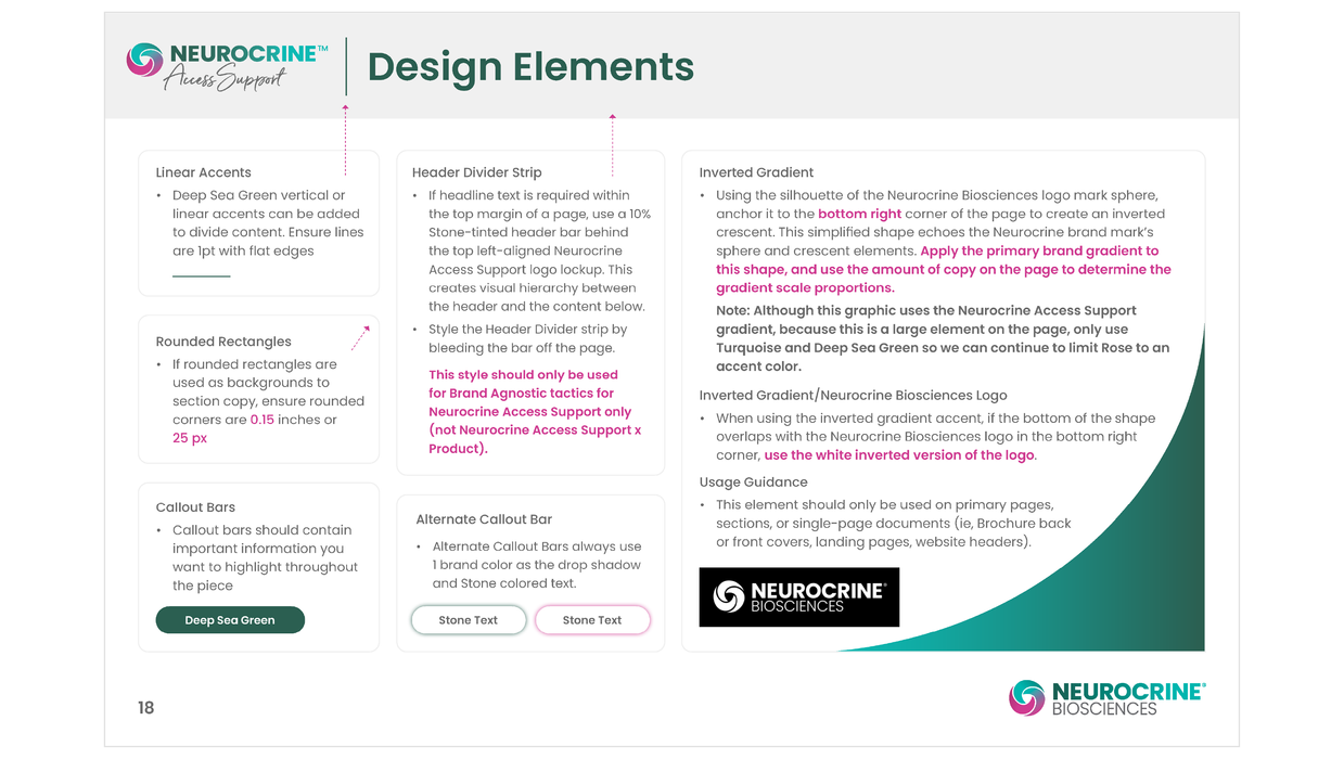
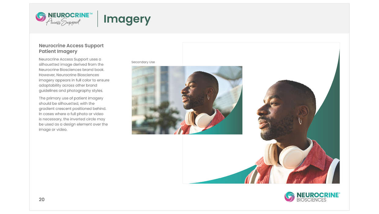
Designing the visual identity for NAS required a flexible system that could adapt across products and audiences while remaining distinct from Crenessity’s branding. Each component needed to pass PRC review, which called for clarity, cohesion, and consistent regulatory alignment.
Explore the complete style guide that brought structure, clarity, and flexibility to a multi-audience brand.
Designing the Patient Website
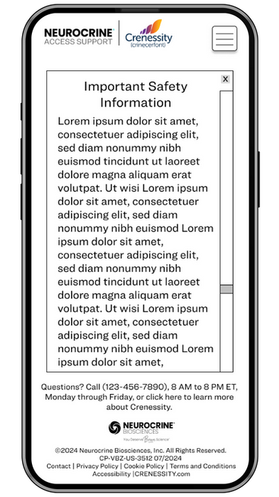
Our goal was to make the experience approachable and easy to follow. Partnering with the editor and medical writing team, I learned the content needed to be written at a third grade reading level to support patient comprehension. I structured the layout around clear hierarchy, step-by-step guidance, dropdowns for dense information, and linear navigation. Each design choice, from spacing to iconography, reinforced a simple and encouraging tone that supported access to care.
See the Patient Website in Action!
Designing for Healthcare Professionals
For the HCP website, our priority was to ensure healthcare professionals could easily access critical patient resources, most importantly, the enrollment form. To support this, we included clear call-to-action buttons on every page, making key tools consistently available. I also aligned the structure and visual flow of the HCP site with the patient-facing site, allowing providers to guide patients through the experience seamlessly. This mirrored layout helped create consistency across both platforms while maintaining clarity and usability for the HCP audience.
Walk Through the HCP Website
Project Reflection
Creative Oversight
The biggest challenge I faced and overcame in this project was maintaining team alignment and design consistency amid evolving direction, shifting client needs, and cross-functional input.
Product Launch
Under tight timelines and late-stage reviews, my team worked extended hours to implement feedback while protecting the integrity of the design. The launch delivered a cohesive brand applied consistently across Neurocrine Access Support materials. This foundation was key to maintaining visual alignment as the brand evolved and to supporting future product introductions.
Following launch, we planned to refine messaging and expand the brand alongside INGREZZA (valbenazine capsules). To learn more about my approach to additional NAS products, click here to explore the INGREZZA project.
Interested in exploring more projects or getting in touch? Click below to view my portfolio or contact me.


